
SPARK Rebrand & Website
Following the 2019 acquisition of Elevator Up, Spark Business Works experienced significant growth by expanding its services, diversifying its client base, and evolving its internal culture. However, its original branding, which was corporate, passive, and black-and-white, no longer aligned with the company's new direction. Through a collaborative design workshop with leadership, we uncovered Spark’s future vision and translated it into a bold, hype, and innovative visual identity that better reflects who they are today.
Client
SPARK Business Works
My Role
Lead Designer
Software Stack
Sketch App, InVision, Miro, Adobe Creative Suite

Following an acquisition, the company’s legacy branding was "passive" and restrictive, failing to reflect its expanded service offerings and vibrant internal culture.
Challenge
Facilitated stakeholder workshops to develop a scalable design system and bold visual identity that unified sub-brands and aligned the digital presence with the company's future vision.
Solution
Old Website
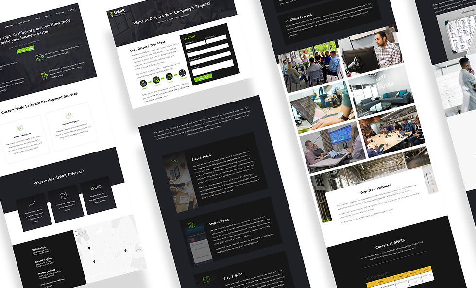
While the previous website functioned well, its dark, strictly corporate aesthetic conflicted with Spark’s vibrant culture. The goal was to shift away from a somber tone and infuse the design with bold energy to authentically reflect the company’s new identity.
Company Interviews x Affinity Mapping
We engaged stakeholders and employees through surveys to define target markets, uncover pain points, and align on a unified brand vision for the future.

Company Interviews x Affinity Mapping
We engaged stakeholders and employees through surveys to define target markets, uncover pain points, and align on a unified brand vision for the future.
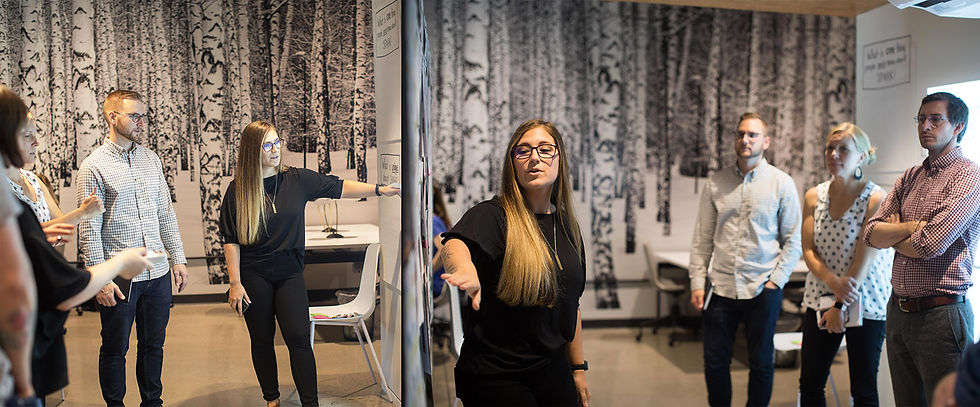
Branding Workshop
We facilitated a design workshop to learn about the ideal tone and voice of the brand for the new brand refresh. Key patterns in brand traits arose on what to avoid and what is desirable for the future state.
Less Corporate
Less Subtle
Less Formal
Less Passive
More Bold
More Hype
More Approachable
More Personal

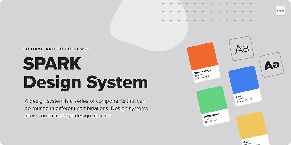
Three style tiles were created based on desired brand personality traits pulled from the design workshop.
Style Tiles
#21D679

SPARK Green
#2E7DF7

Hype Blue
#FF5E00

Select Orange
#F6C644

Safety Yellow
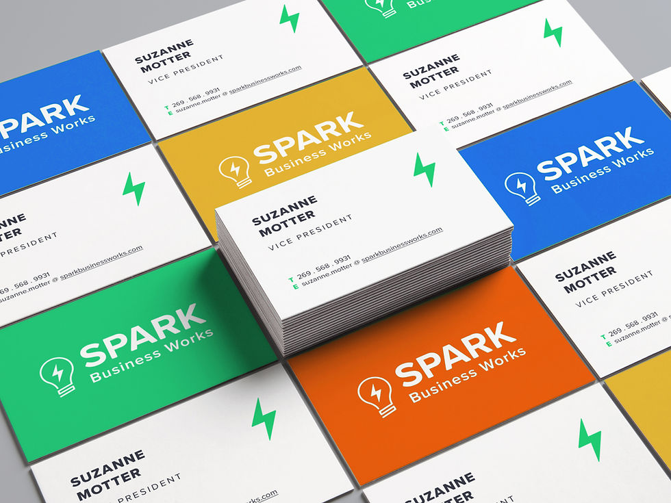
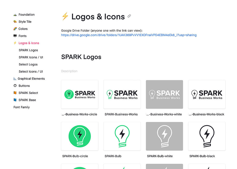
We designed a scalable logo system built to accommodate future sub-brand expansion.
Updating the Logo
Original Logo
Personal Logo Iterations
Final Team Logos
Presenting the Brand
Personally led the company-wide reveal, guiding the organization through the end-to-end design journey to foster a deeper understanding of our new strategic direction
New Design System
We designed a scalable logo system built to accommodate future sub-brand expansion.
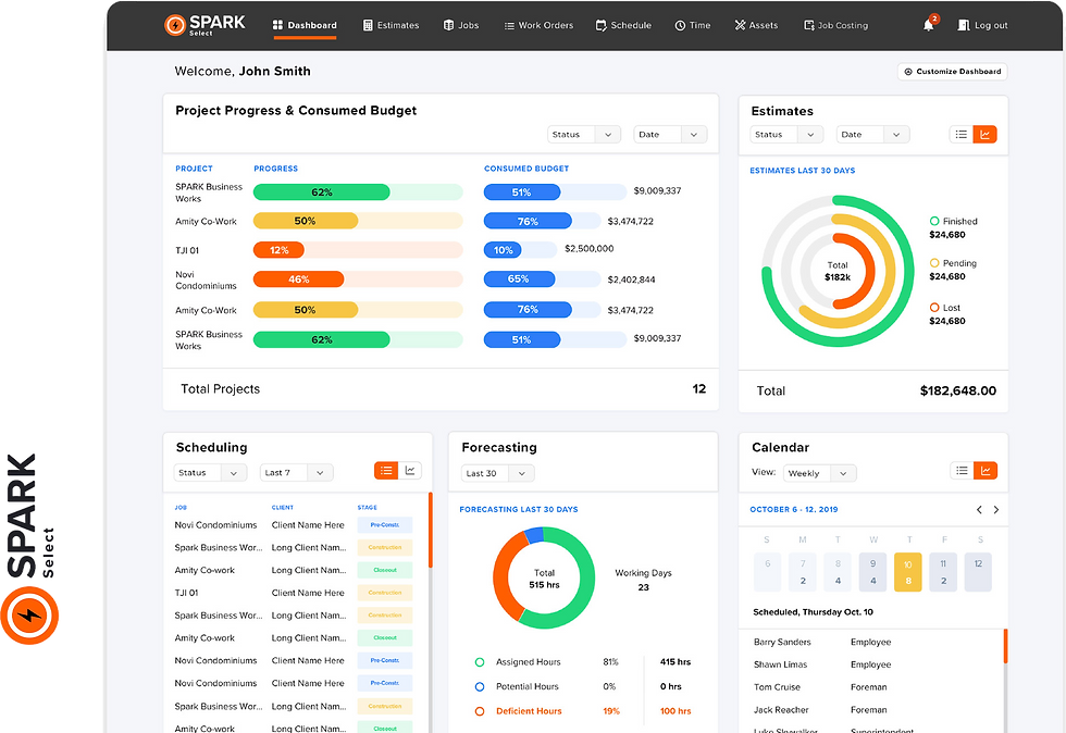
A prototype was built for one of SPARK's sub-brands, SPARK Select, introducing a dashboard design for promoting our custom service.
Subsequently, the newly crafted SPARK branding was integrated across all sub-brands for a unified and cohesive visual identity.
Sub-Brand Prototype
Final Prototypes
